Sunday, 29 April 2012

Publication Plan


Publication Plan;
Title; Boombox
Positioning statement; 'The number one magazine for all the latest top tunes!'
Frequency of publication; Monthly
Price; £3.50
Distribution; Newsagents, Supermarkets. The supermarkets include the big name one's such as; Tesco, Sainsbury's, Morrisons, Asda.
Rationale; The approach of my magazine will mostly be based around what I believe people of my target audience will want to read. Within the magazine, I feel that it would be good to include reviews from the month, without containing over the top words that teenagers won't be able to understand. Another aim is to make the magazine informal so the audience can relate to it. Whilst sticking to these aims we also want to make everything simple for our potential customers, as we don't want to confuse them with technical terms.
Style; The style of my magazine will be relatively informal. The magazine will offer readers reviews of the latest charts and singles being released. The magazine will also give the audience an insight to the lives of the different artists within the genre that the magazine will be representing. The information added will be exciting and will keep the reader interested throughout, which hopefully will ensure they continue to buy the magazine.
Regular Content:
Editors Letter.
Reviews of the current singles and albums in the chart.
Gig reviews.
Album of the month
Interviews with different artists.
Song of the month.
Artist of the month.
Video of the month.
Featured Content:
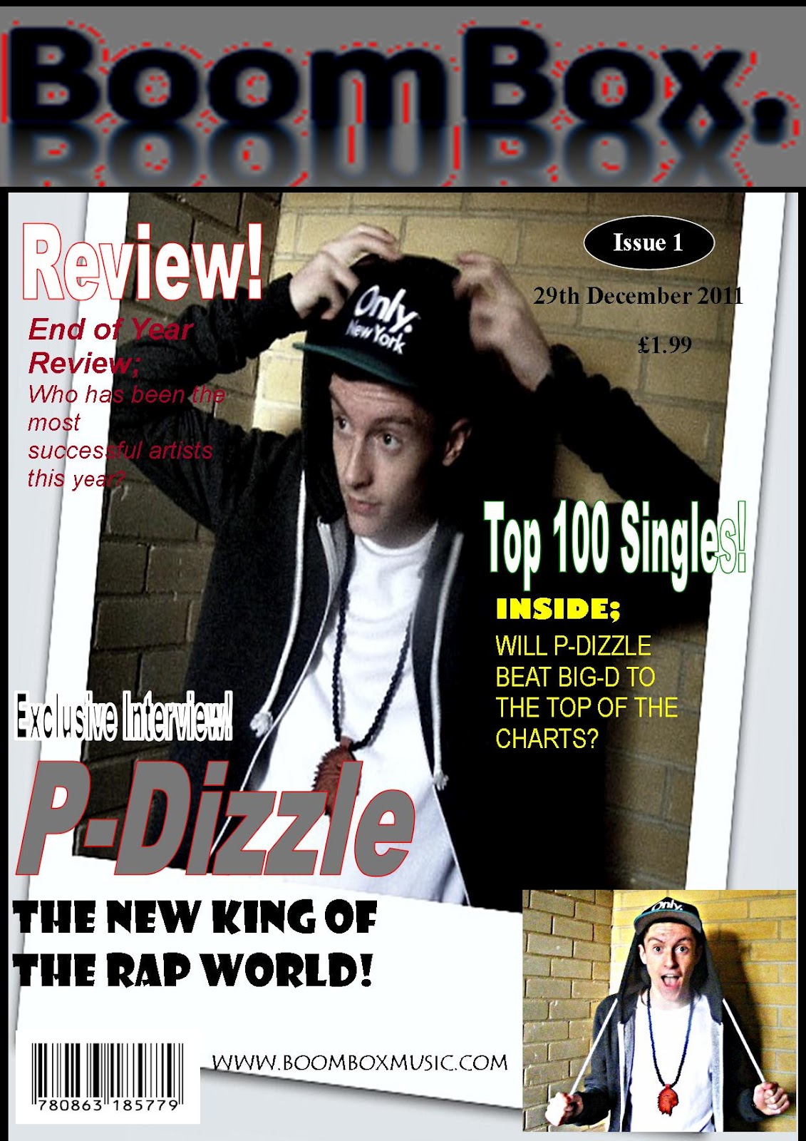
Main interview with P-Dizzle.
Top 100 Singles within the month.
Review of the year.
New video releases.
New song releases.
What's hot this month.
Rationale
Headlines; Word Art
Body Text: Calibri

Colour Scheme- To fit in with the genre the colours will be dark, to give the urban feel. Colours such as;
Black
Grey
Dark blue

Evaluation Question 5

Front Cover; I attracted my target audience through the different use of colours. The different colours I looked to use were the dark colours such as black and grey. These gave out the urban look, ensuring it linked in nicely with the genre of the magazine. The use of the large heading also attracted the audience, due to the fact it slots in nicely with the dark and mysterious background of the magazine front cover. Furthermore, I think the picture, would attract the audience because of the Mise en scene, and the low camera angle. The mise en scene, is evident adding emphasis to the genre, whilst the low camera angle is proving the dominance of the artist. Finally I think the subheadings will attract them, as it allows them to see what will be in the issue. The fact they are shown in bright colours is an eye-catching technique.


Contents page; The splitting of the information is a way in which I aimed to attract the audience. The audience would be able to see the key stories that will be featured in the magazine through the use of the page numbers and text on the contents page. The unusual shaping of the 'Contents' sign would also attract the audience, plus with the bright colours, as they are eye-catching, meaning that the audience will be able to pick this magazine out when browsing through the shops.


Double page Spread; The main article was the main thing that I used to attract the audience. It enabled them to find out all the latest news, plus they recieved an exclusive interview from the main artist for that month. This is an extra that all magazine editors tend to add in to, in order to strive to get more customers buying their magazine. Furthermore, the urban scene is once again created through the background, by the use of the dark colours, once again helping to catch the audiences eye. I have used two small pictures which have helped me relate to the stories in the article and with the key quotes that I pulled out from the article. They key quotes help to break the information down and allow the reader time to process their thoughts. The sensible font finally is another way that the magazine helps to attract it's audience, as it is easy to read, therefore it's just no nonsense and no hassle for audience and it fits in nicely with the whole background.

Question 7


How I have bettered since the preliminary task;

Software;
When I first started my project, I had never used a blog before, so it was a first for me. As time went on, I got used to it and have produced a effective media blog.
From my preliminary task I feel that it is evident that I have picked up skills on the way. I think the way that I edited my pictures through the use of photoshop and also created different presentations through the use of Prezzi. I believe that these skills that I picked up helped me ensure that my project looked effective. Picking up on the skills I used to edit my pictures, you can see a great difference on my front cover and contents pages, which is what I wanted to succeed in when I first planned and organized my project.
Photography; 
I believe that you can see a huge difference in my photography, throughout the project, conveying the different skills I have picked up on the way. At the beginning of the project, I was shaky and my pictures didn’t come out as I wanted them. Also, most of them had no significant meaning. For my preliminary task, I managed to take 2/3 good pictures that established the genre and fit well into the magazine. Other than that, the rest I didn't like and had to scrap.  In difference, I went into creating my music magazine with much more confidence and I feel that the pictures I took for it looked relatively good. I used a mixture of shot types and angles to add a twist to the magazine and make it look more exciting, which was different to the ones from the preliminary task, as they were plain and boring.
Layout; 
Before starting my music magazine, I didn't really have much insight in how they were supposed to be laid out. However, with a bit of research and the use of the preliminary task, my knowledge of the layout grew stronger. Whilst my knowledge of the layout was getting stronger, I was learning the sufficient codes and convetions that a music magazine should have in order to grab their audience and potential readers. The conventions included the color scheme and the different types of headlines. You can see from my two magazines that my knowledge of layout got stronger, especially from my main music magazine.

Conclusion
In conclusion, I think that there is an obvious difference shown between the magazine for the preliminary task and the one for the main task. This difference has come from improvements in my techniques on such websites like Photoshop and also the fact that I now have a greater knowledge of the codes and conventions of a magazine. My photography skills also vastly improved, showing a difference between the two tasks.

Evaluation question 6

Evaluation Question 4

Evaluation Question 3


Music magazine Evaluation- Question 3: What kind of media institution might distribute your product and why? 
The media institution that might distribute my product would be InterMedia Partners. InterMedia Partners are the institution that distributed Vibe magazine, which is of a similar genre of my product, which could therefore compete with Vibe.  My product not only gives out a competition with Vibe magazine, but it could also offer InterMedia Partners with a rivalry magazine, which could help them be more successful as a distributor. 
My magazine is most likely to be sold in such big range supermarkets as Tesco and Sainsbury's because they are two highly prospering supermarkets where the audience can buy their magazines from. WHS smiths is another place which would be good to sell my magazine from, as they are a book store, which is very popular for the sales of magazines therefore this would be a good place to try and improve sales. 

Evaluation Question 2

Firstly, One way I think my media product can relate to particular social groups is through the use of my colour scheme. The dark colours of black and grey help give out the urban twinge, which is what the majority of the R&B genre want when buying a magazine. My colours also help to convey that despite being generally related to both males and females, it is mostly a male based magazine. Most of the article produced in my magazine are based at the younger teenage years of my target audience. Due to my magazine being related to a mass audience, I had to think about splitting it into sections and who is most likely to buy every issue, therefore that's why most of the articles are based around them. I haven't really focused on the disabled social group mainly because there is only a small minority of people who are disabled and they are not likely to be attracted to this kind of music. Overall, my media product relates to all races and religions. This is because the R&B genre is a broad genre of music where many people are attracted to, therefore it is targeting everyone.