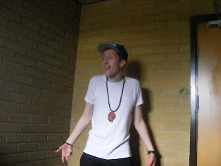
This is my first picture of my artist, without editing. It is shot in a medium shot, with a low camera angle. The mise en scene and location is evident in this picture. The picture allows the audience to view the costume and props that the artist is currently wearing. The main thing I don't like about this picture is spacial relationship. I feel that the wall in the background is too much in view, which makes it look like an ordinary photo, which is not something you would find in a magazine. The pose and stance of the artist relatively fits the genre, conveying a sense of his arrogance furthermore, the way he is looking away from the camera. To make this look effective, I need the background to be smaller and also improve the shot type, as it doesn't really look like something you would find in a music magazine.
This is the edited version of the picture. For me, it looks much better than it did in the first picture. Firstly, I have enhanced a much more darker tone to the picture, making it look a much more serious image. In turn, this would suit my magazine, as I aim to make it a serious magazine. Secondly, the background was a problem in the first picture. However, through the use of editing, I managed to ensure the spacial relationship between the artist and the background. With the fading of the colour, the more urban feel is given out, which is linking into the genre really nicely, plus links very nicely into the younger generation of target audience. Also with the darkened background, shadows start to merge, which as well as creating a serious look, it creates a rather mysterious image, which links into the storyline, as nobody really knew about this artist before he mysteriously came out and started releasing music.


No comments:
Post a Comment